
You should use a process different from designing web pages for creating emails. You will need to combine your branding elements, other visuals, and text in a simpler way to be effective, given the constraints of email.
The drag-and-drop email designer in HubSpot is specifically engineered to account for how different email clients, such as Outlook, Apple Mail, and Gmail, display emails. By designing your emails with this compatibility in mind, you significantly increase the likelihood that your email will appear to the recipient exactly as you intended.
Layouts
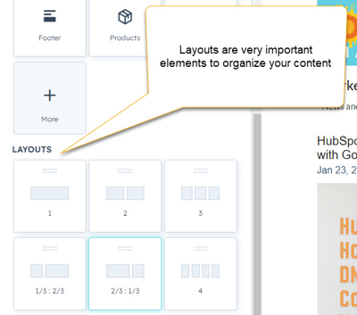 You should organize your email content into sections. But follow the rules–don’t go crazy and add too much content, or the reader will be overwhelmed and move on. In his book “The Paradox of Choice” Barry Schwartz talks about how too much choice is detrimental to human psychology and leads to states of anxiety and decision paralysis. “A confused mind says no.”
And just because the system allows you to include multi-column layouts doesn’t mean you should. Check out any multi-column layout on mobile. You will typically be unpleasantly surprised with how a multi-column email renders on mobile, and you will usually have to go back and edit your email back to single-column.
Lastly, don’t override or try to force HubSpot email modules to do things they should not.
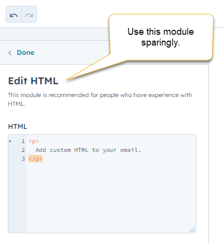
HTML - Modules
Minimize the use of HTML-module sections. Do not use the ability to insert HTML code to shortcut a design, as it will only cause problems later. HTML modules are for emergencies. If you need to drop in something unique that you can not do with any other module, go for it, but test, test, test before you hit send. If you find a custom HTML module is required repeatedly, hire a talented HubSpot Developer to build a custom module.

Of course, on-brand design is essential. It is one of your most valuable assets. However, your brand should have some flexibility to incorporate adjustments to provide the best email results, prompting positive action from intended recipients.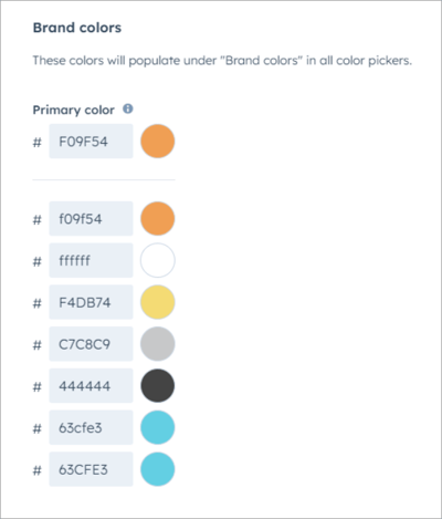 Edit your brand settings in HubSpot to set your brand colors. That way, they appear in your favorites when you add color to buttons and text.
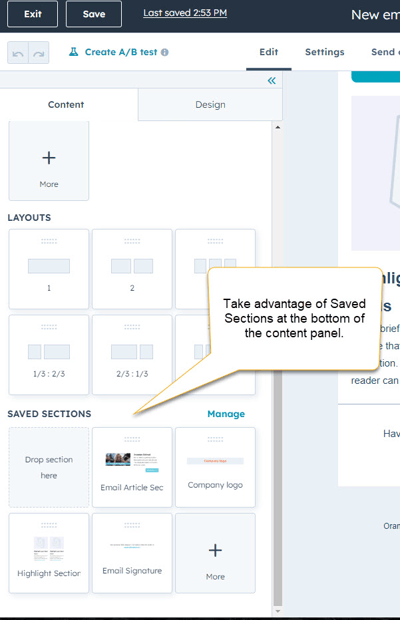 Also, take advantage of the Saved Sections feature in the email Content editor. This feature allows you to save any sections you have customized with your brand and design to reuse over and over on other emails. Saving items is a big time saver and a great way to preserve brand, design, and content elements.
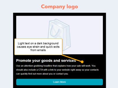 There are instances where light text on a dark background makes your point stand out, but email text is not one of them. Use light text on a dark background sparingly, as it's great for highlighting extremely brief copy or menu items. However, avoid using it in large sections since it strains the eye and causes headaches due to blurring, known as halation.
Halation occurs more online than in print because the white on screens is brighter than on a printed page. The white color activates all three color-sensitive receptors in the human eye almost evenly, resulting in heightened stress when reading paragraphs displayed in white against dark backgrounds.
It is also worth noting that up to half of all people have astigmatism, which causes the eye to have difficulty focusing light, particularly with fine lines against dark backgrounds. This condition causes text to blur and become unreadable, so it is essential to consider the legibility of your text and the comfort of your audience when designing emails or any text-heavy content.

Back to Top
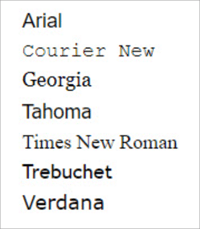 It's best to stick with simple and easy-to-read fonts when sending emails. While you may have a particular font for your website or printed materials, avoiding using them in emails is best. Instead, select the most recognizable and email-friendly fonts that closely match your brand's style and size.
Ensure your emails are clear and easy to read by keeping your font simple, which helps convey your message as intended. Arial, Tahoma, and Times New Roman are common examples of simple font styles.
Every email you send should include a call to action you want the reader to take. And NOT several calls to action (e.g., download this, click our social media icon). The best results come from a single action request that is easy to understand and made with an urgency or enticement (like the promise of a download, discount, link to sign up for a webinar/newsletter, etc.) that appeals to the reader.
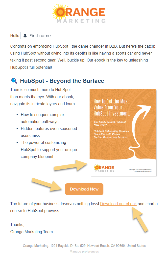
That's not to say you cannot repeat a request, however. Below is a perfect example. The entire email is about one subject–an ebook–that we continually request the reader click to download. We ask for a CTA button, an image, and a hyperlink. It is clear to readers who may be giving this email a cursory view on a small screen what we are asking them to do.
Testing is always a good idea. You should test your CTAs to see what works with your audience, changing up button styles, vernacular, images used, etc.—Check out our post on ChatGPT Generated Email Subject Lines and CTAs for more what-to-try tips!
What do you look for in a responsive design? Do the email elements look how you intended on different devices and email clients? Is the content stacking in the correct order on smaller screens?
Test, test, test. The only way you will know how an email might appear is to test it. Have a small internal test list you can count on to review and provide feedback. Also, use the Preview tools in HubSpot. They work wonders to identify problems before they happen.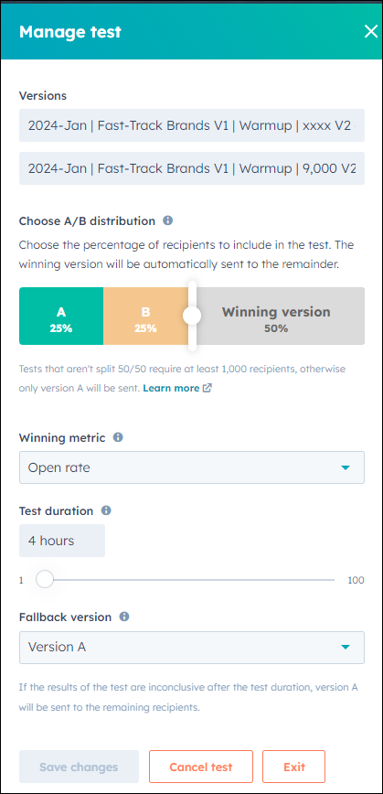
A/B Testing
HubSpot has native A/B testing built right in. It is extremely handy!
Do you want to test two subject lines?
Or would you like to test different images?
Maybe you want to try different copy or those CTAs?
Just use the HubSpot A/B testing feature which will split your list in half, send 50% to "A" and then 50% to "B", and then send the remainder of the list either "A" or "B"” No definitive answer gets "A".
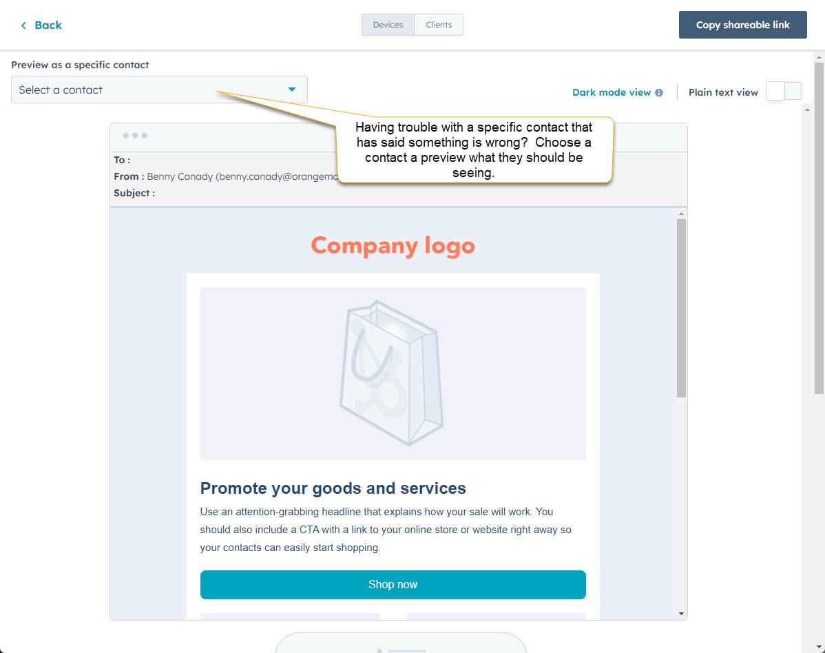
Using Specific Views to Test Emails Clients and Devices (HubSpot)
Devices - Contact preview - This view allows you to select a specific contact to see what they will see from your email. Previewing in HubSpot is a great way to troubleshoot particular feedback from internal stakeholders and external contacts.
Clients - This view allows you to run a complete test of various email clients and devices you select. Litmus is the tool that powers this and is a valuable tool included with your HubSpot. Be sure to check notoriously bad email clients such as Outlook 2016. But don’t spend too much time on one client unless it is a high performer for your emails
Check your report from a few previously sent emails and see the ranking of email clients. Focus on your top performers. But of course, try to make them all perfect if you can.
Get Your Email Working for You!
While marketing emails are getting harder and harder to execute thanks to the likes of Google and Yahoo, email’s impact can still significantly contribute to your marketing efforts. You can enhance your email marketing strategy by focusing on layout optimization for a better customer/prospect experience, adhering to design principles that suit the unique nature of emails, and keeping content organized in manageable sections.
Remember, restraint is key – don't overwhelm your audience. Additionally, the emphasis on brand consistency, responsive design, and meticulous testing underscores the commitment needed to deliver impactful emails across various devices and clients.
By incorporating these seven best practices, you're not just designing emails; you're crafting a powerful tool for meaningful engagement and successful B2B sales goals. So, embrace the tools HubSpot offers, refine your approach, and watch your email campaigns thrive in a cluttered digital landscape.